
Red is a powerful color. It conjures passion, excitement, and intensity. From bright, energizing crimsons to deep, grounded burgundies, red makes a statement.
Undoubtedly, red remains an iconic brand color for major companies and small businesses. It attracts attention, conveys confidence, and motivates action when used effectively.
In this guide, we’ll explore the psychology behind red, check out real-world examples of successful red color palettes, and help you build your palette to make your brand pop in 2024.
The Meaning & Psychology behind Red Color
Red is rooted in our biology. Our eyes are more sensitive to warmer tones like red and yellow, so these colors instantly grab our attention.
In fact, research shows that people’s pulses quicken, and they breathe a little faster when seeing red. This is because red signaled danger for our ancient ancestors – blood, fire, and predators. We still retain some of that primal gut reaction.
Of course, context matters. While red can signal danger, it also represents love, passion, excitement, and action.
Some key meanings and impressions of red color include:
- Intensity: Red conveys confidence and immediacy. It’s bold, demanding, and energetic.
- Exhilaration: Seeing red gets your blood pumping faster. Red symbolizes adventure, novelty, and thrill-seeking.
- Love and passion: Red is Cupid’s color, associated with the heart and strong romantic feelings. It also generally signals sensuality and sexuality.
- Action and urgency: Red is a call to action. It motivates people to tap into their drive and determination to accomplish things.
- Aggression: In some contexts, red represents anger and aggression. But used selectively, this can denote power and dominance.
- Celebration: In many cultures, red symbolizes good fortune and is worn to celebrate joyous occasions like the Chinese New Year.
Brands leverage these associations to shape perceptions of their product or company.
A charity may use red accents to inspire urgent action, while a retailer incorporates red to trigger excitement and adventure.
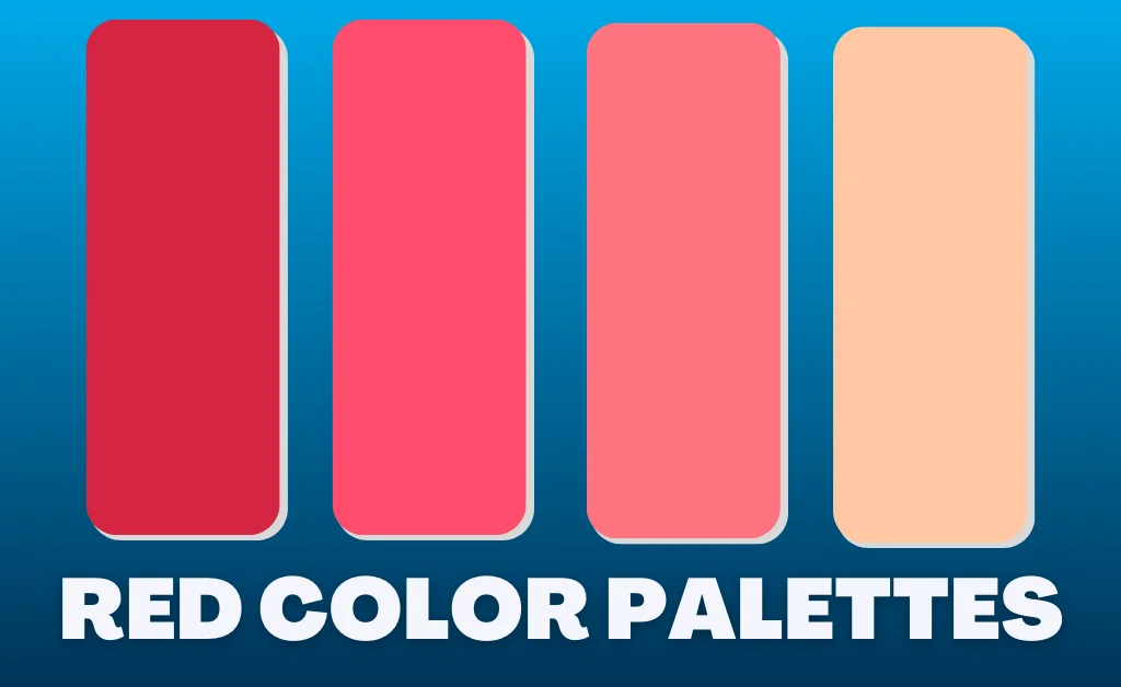
Top Red Color Palettes for 2024
Ready to harness the power of red for your own brand? Browse these stunning red color palettes, perfect for 2024.
1. Cherry Chocolate Color Palette
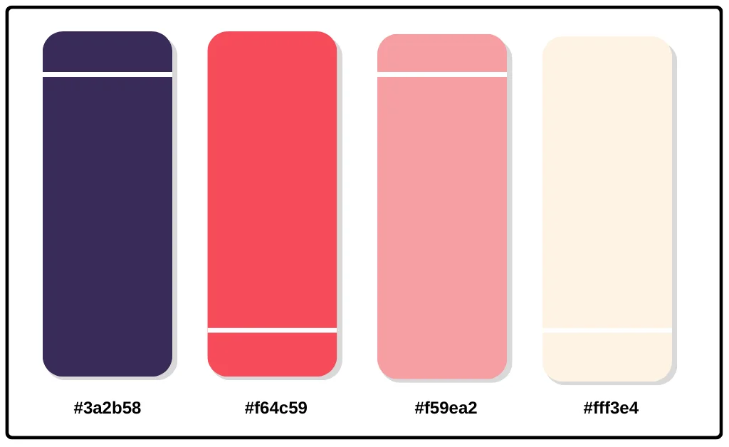
Hex Codes: #3a2b58 // #f64c59 // #f59ea2 // #fff3e4
Vibrant yet sophisticated, this palette pairs deep chocolate browns with lively cherry red accents. It’s bold yet approachable – ideal for fashion, beauty, or hospitality brands.
2. Marsala Sunset Color Palette
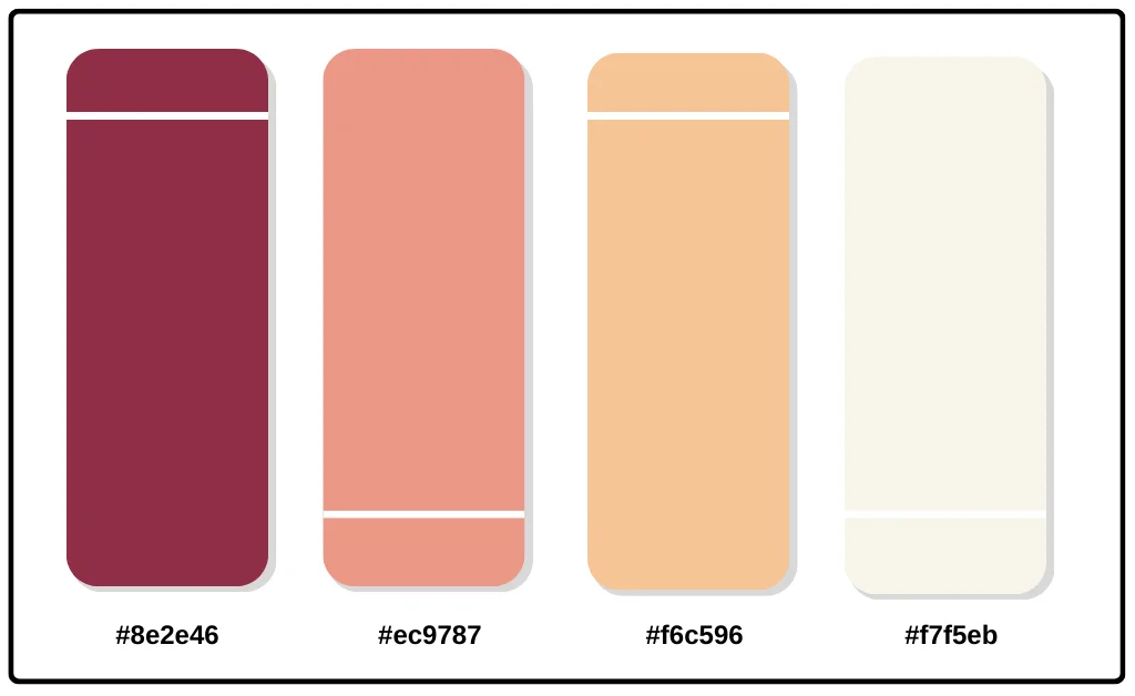
Hex Codes: #8e2e46 // #ec9787 // #f6c596 // #f7f5eb
Earthy maroon anchors this warm, terracotta-inspired palette. The red pops against neutral taupes and creams. Perfect for health, wellness, and eco-conscious products.
3. Cherry Vanilla Color Palette
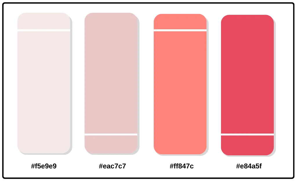
Hex Codes: #f5e9e9 // #eac7c7 // #ff847c // #e84a5f
This monochromatic red palette features cheerful cherry tones brightened with pink and softened with creams. It’s playful yet refined – great for children’s media or feminine lifestyle brands.
4. Sangria Sunset Color Palette
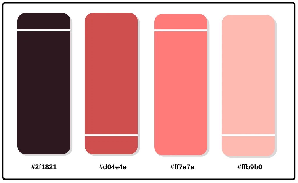
Hex Codes: #2f1821 // #d04e4e // #ff7a7a // #ffb9b0
Feeling summery? This mouthwatering palette looks good enough to drink. Deep burgundies contrast with sangria pinks and peaches. Perfect for warm-weather lifestyle products.
5. Cherry Blossom Color Palette
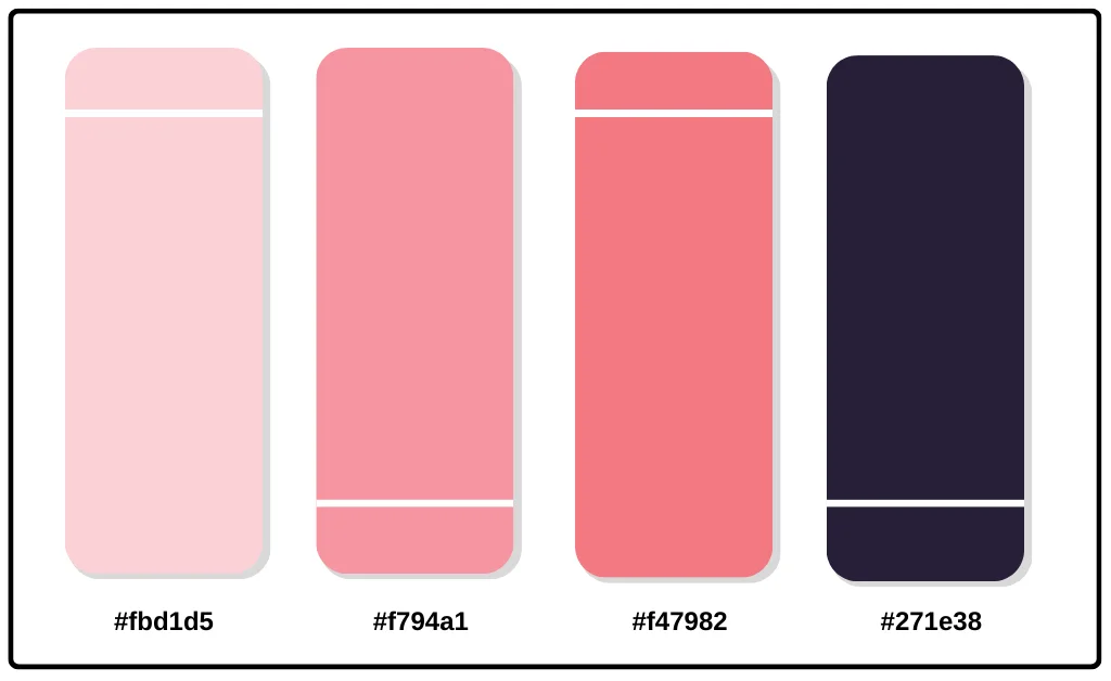
Hex Codes: #fbd1d5 // #f794a1 // #f47982 // #271e38
Pretty in pink, this Japanese-inspired palette pairs bashful blossom colors with regal lavenders. Use it to promote beauty, fashion, or femininity.
6. Crimson Apple Color Palette
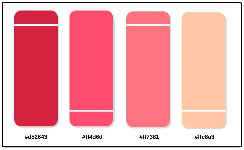
Hex Codes: #d52643 // #ff4d6d // #ff7381 // #ffc8a3
This palette pops with primary red alongside orange-pinks, evoking ripe fruit. Vibrant and appetizing. Perfect for food and beverage products.
7. Garnet Jewel Tones Color Palette
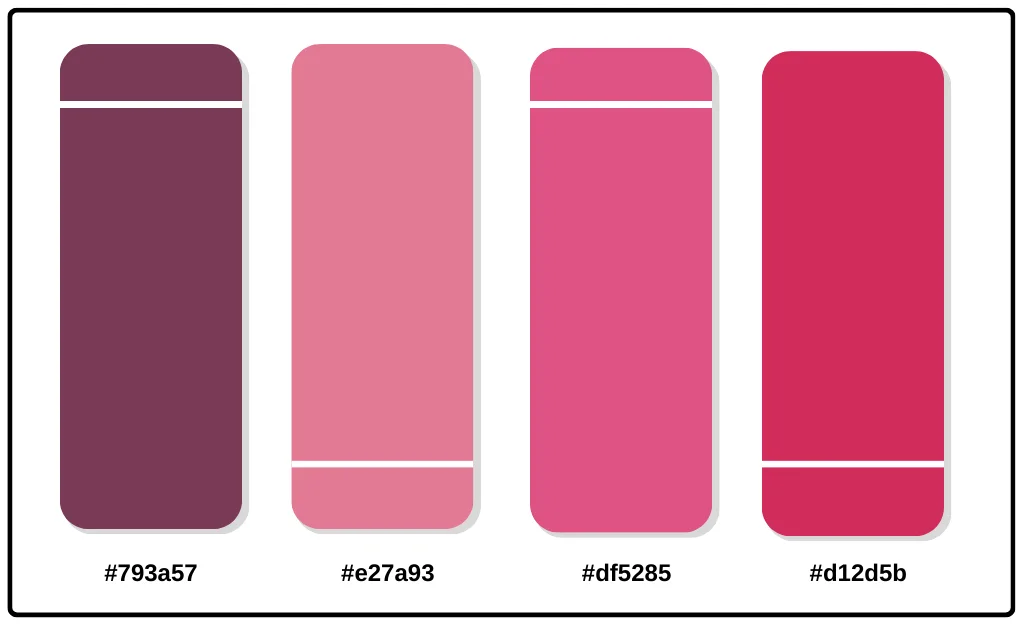
Hex Codes: #793a57 // #e27a93 // #df5285 // #d12d5b
Deep garnet red takes the spotlight among these rich jewel tones. This palette has an air of luxury, making it ideal for premium fashion and beauty brands.
8. Chili Pepper Color Palette
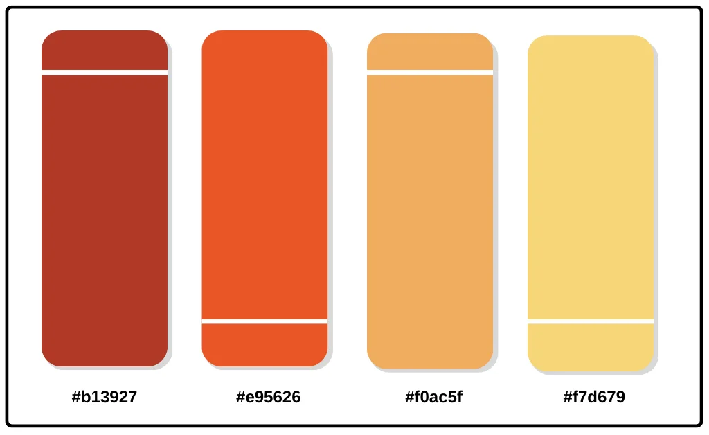
Hex Codes: #b13927 // #e95626 // #f0ac5f // #f7d679
Turn up the heat with these peppery reds and oranges. Punchy yet playful. Perfect for brands that want to ignite fun and flavor.
9. Rose Quartz Color Palette
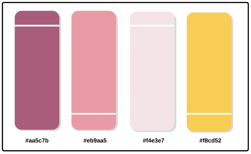
Hex Codes: #aa5c7b // #eb9aa5 // #f4e3e7 //#f8cd52
You’ll love at first sight with this dreamy palette blending rosy pinks, romantic reds, and soft creams. Ideal for adding tenderness to your brand.
10. Fiery Sunrise Color Palette
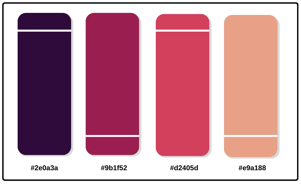
Hex Codes: #2e0a3a // #9b1f52 // #d2405d // #e9a188
Wake up and seize the day! These fiery reds, oranges, and yellows burst with energy and optimism. Made for motivation brands.
11. Cranberry Spice Color Palette
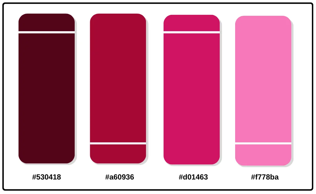
Hex Codes: #530418 // #a60936 // #d01463 // #f778ba
These rich, vibrant jewel tones will spice up any winter design. Pair deep wines with bright Fuschia for stunning contrast.
12. Rose Gold Color Palette
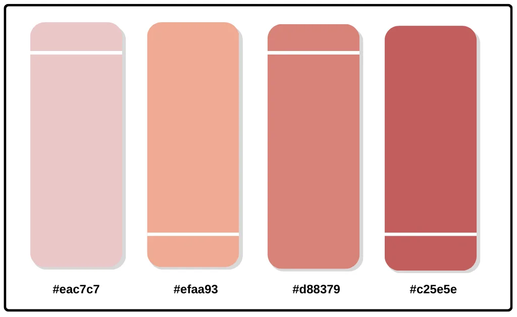
Hex Codes: #eac7c7 // #efaa93 // #d88379 // #c25e5e
This luxurious palette features warm metallics reminiscent of the trendy rose gold jewelry finish. A creamy white and blush pink provide a clean and airy contrast to the rich, coppery tones of the rose gold.
13. Scarlet Sage Color Palette
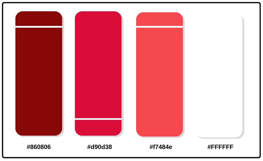
Hex Codes: #860806 // #d90d38 // #f7484e // #FFFFFF
Bold and commanding, this high-contrast red palette makes a dramatic statement. The bright pops of scarlet paired with clean white space demand attention.
14. Merlot Color Palette
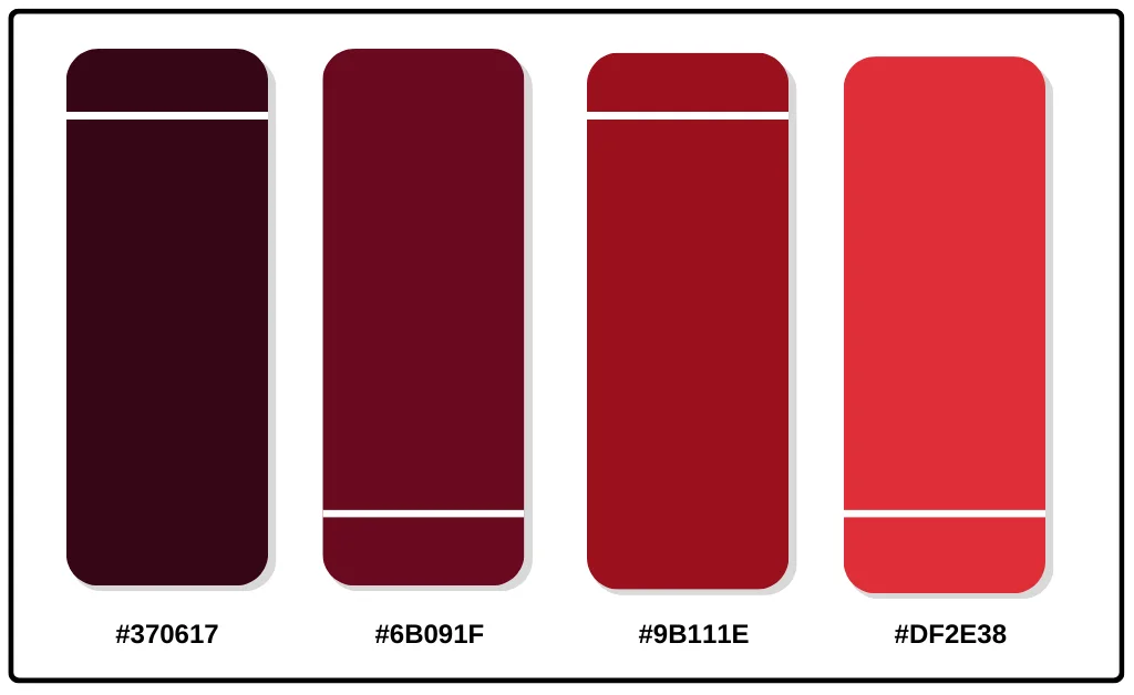
Hex Codes: #370617 // #6B091F // #9B111E // #DF2E38
Deep, rich merlot anchors this sophisticated palette. Accent with lighter reds or orangey corals for a refined yet playful look.
15. Cherry Cobbler Color Palette

Hex Codes: #091F37 // #EF5839 // #FC642D // #FF7B00
Hungry for something bright and delicious? This vibrant palette looks sweet enough to eat. Cheerful colors are perfect for food brands.
16. Blush Color Palette
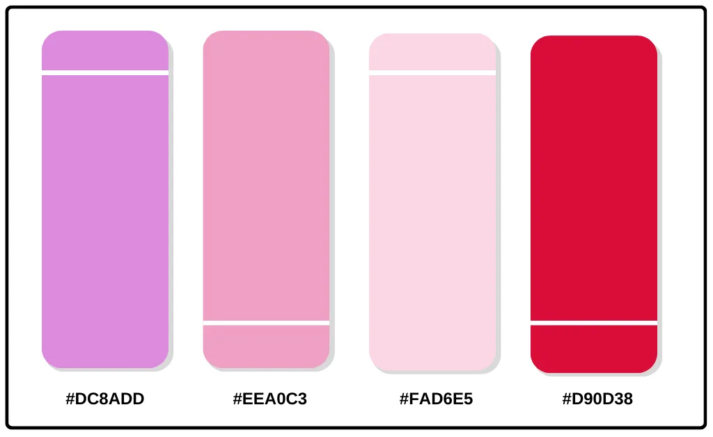
Hex Codes: #DC8ADD // #EEA0C3 // #FAD6E5 //D90D38
Pretty in pink, this soft and romantic palette adds a delicate touch. Use it when you want to be flirty and fun.
17. Sangria Color Palette
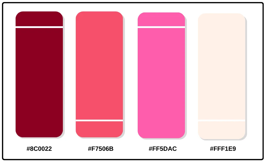
Hex Codes: #8C0022 // #F7506B // #FF5DAC // #FFF1E9
Celebrate sunny days and warm nights with these mouthwatering summer hues. Fruity colors that refresh and invigorate.
18. Retro Pop Color Palette
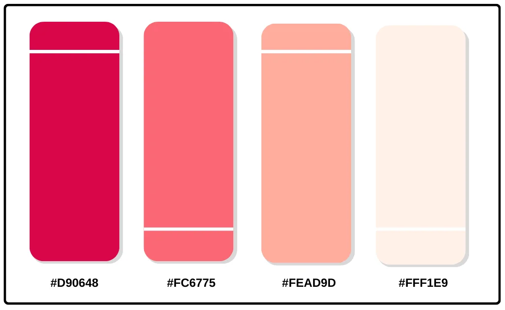
Hex Codes: #D90648 // #FC6775 // #FEAD9D // #FFF1E9
Bright and bubbly, these playful pastels are framed by feel-good fuschia. It has fun, groovy colors straight from the 50s and 60s.
19. Rosewater Color Palette
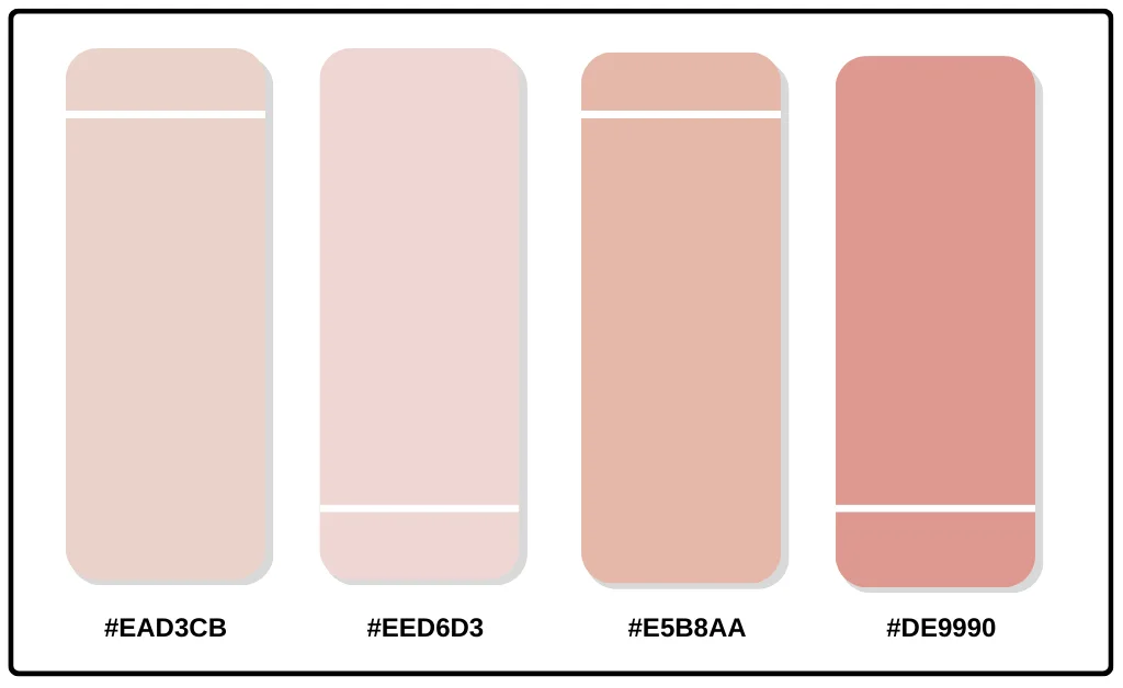
Hex Codes: #EAD3CB // #EED6D3 // #E5B8AA // #DE9990
This delicate pink palette works beautifully for feminine brands wanting to channel grace and tenderness.
20. Velvet Rouge Color Palette
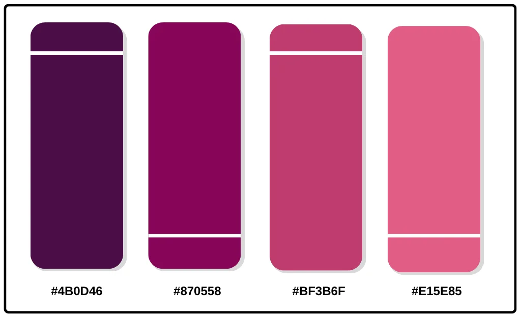
Hex Codes: #4B0D46 // #870558 // #BF3B6F // #E15E85
Sultry, mysterious, and utterly captivating. Deep wines and burgundies pair temptingly with hot fuschia pinks. Seductive color at its finest.
Best Red Color Combinations
Ready to pair red with other colors to make your brand pop? Here are some of the most effective combinations.
Red and black
This classic color pairing oozes drama and sophistication. The high contrast looks elegant, bold, and powerful together. Use black backgrounds to make red icons and accents stand out.
Red and white
Like black and red, this combination offers loads of visual contrast. But instead of darkness, white amplifies the brightness and cheerfulness of red. Clean red logos pop beautifully on white backdrops.
Red and blue
In color theory, red and blue are complementary colors, creating strong contrast and grabbing attention when paired. Use them together sparingly to highlight important clickable actions.
Red and green
Red and green are another complementary duo, invoking the cheerful hues of Christmas. Together, they signify growth, organic wholesomeness, and abundance.
Red and yellow
Both attention-grabbing warm tones, red and yellow, feel energetic and optimistic together. Consider them for brands selling adventure, excitement, or fun.
Red, black and white
This patriotic color scheme has cross-cultural appeal. The tonal contrast looks bold, memorable, and authoritative. Rely on it to convey reliability and trust.
Brands with Red Color Palettes
Check out how these major brands harness the power of red in their visual identities.
1. YouTube
YouTube’s iconic red play button anchors its brand recognition, contrasting effectively with white and black interfaces. The color alludes to the passion and excitement of watching videos.
Over the years, even as YouTube’s site design has evolved, it has retained red as its distinctive brand color. The red subscribe button transformed into a red play button icon, now appearing on countless worldwide screens, instantly signaling video content.
Beyond just the red play button, YouTube uses red across its branding, including its stylized logo icon, the progress bar showing viewing time, text links directing to other videos, and more. Red signifies interaction opportunities.
2. Netflix
Netflix splashes red across its logos, branding, and marketing to grab attention and allude to entertainment excitement. Black backgrounds make the red wordmark pop.
The red logo pops brightly against Netflix’s black interfaces and dark backgrounds. This high contrast immediately catches the eye, like the allure of bingeing another captivating episode. The red is energetic, passionate, and intriguing.
Beyond red logos, Netflix incorporates red graphics, textures, and photography throughout its browsing interfaces and marketing materials.
3. Coca-Cola
Coca-Cola’s timeless red and white color scheme conveys simplicity, cheerfulness, and refreshment. Red branding pops up on store displays and vending machines.
Coca-Cola’s advertising has reinforced Red as the color of enjoyment, happiness, and the all-American experience. Holiday campaigns connect red and winter cheer, while summer ads feature red-clad Santas enjoying a frosty bottle at the beach.
The strategy clearly works red = soda = Coke. No wonder red owns superior brand recognition in the beverage industry.
4. Target
Target uses a patriotic red and white palette to signify reliability and fun. Bold red shopping carts and signage help shoppers instantly spot their stores.
Red is about more than just visibility for Target. Red confers a cheerful, helpful personality as a discount retailer providing quality furnishings and apparel. The red shopping carts offer convenient assistance, while red sale signs signal savings and smart value.
5. McDonald's
Those iconic golden arches would only shine as brightly with their red background. McDonald’s red instantly signals fast food and family fun.
The red communicates warmth, energy, and excitement, perfect for lively families seeking quick, affordable bites. It contrasts cheerfully with yellow arches promising golden deliciousness and smiles ahead.
For generations, catching a glimpse of glowing red McDonald’s signage has signaled a celebratory pitstop, often accompanied by French fries, toys, and play places.
In summary: Stand out with a red color palette
Red color palettes capture attention while conveying passion and drive. Use them to trigger excitement, romance, and action – perfect for energetic brands.
When developing your red palette, anchor it with a couple distinct red tones, then accent it with complementary or analogous colors. Rely on color theory principles to guide foolproof combinations.
Soon, you’ll have a professional color scheme that helps your marketing materials and branded assets instantly pop.
Read More great articles on MixedNiche.com