Hey friends!
My name’s Karan Jadoun, and in this post, I will walk you through everything I’ve learned about making YouTube thumbnails that stop the scroll and drive tons of clicks.
As someone trying to grow my own channel, I spent weeks studying what the top YouTubers do when it comes to thumbnails.
I poured over 73 pages of notes, watched hours of interviews, and analyzed thousands of high-performing thumbnails.
And in this post, I will distill everything I learned into an easy-to-follow, step-by-step guide.
My goal is to help you create thumbnails that are so compelling that people can’t help but click.
So, get ready; you’ll become a master of thumbnail psychology and design!
Why YouTube Thumbnails Are So Important
I’m guessing you already know this, but let me start with a quick refresher on how vital thumbnails are.
As MrBeast says, “People don’t click, they don’t watch.” A single thumbnail can make or break your video’s performance.
Your YT thumbnail determines 50% of your video’s success. It’s responsible for driving the all-important clicks that then turn into views.
So, if you’re like me and spend hours editing beautiful videos…only to throw together a thumbnail at the last second, we’ve got it all backward!
Instead of spending 90% of our time on the video and 10% on the thumbnail, we should do the opposite.
Top YouTubers obsess over their thumbnails, finalizing them before even starting on the video.
Because at the end of the day, YouTube comes down to a simple equation:
Clicks + Watch Time = Success
A compelling thumbnail drives clicks…and an engaging video keeps people watching. Do both exceptionally well, and your channel will grow!
So, from now on, we need to start treating thumbnails as the priority they are, not an afterthought.
Let’s move on to breaking down exactly how to create click-driving thumbnails.
1. Killer Time Allocation
I can’t emphasize this first point enough:
Spend more time creating your thumbnail than editing your video!
Set aside days or even weeks to perfect your thumbnail before publishing. It’s worth the time investment.
I know it feels backward…but that extra effort is what separates viral videos from flops.
If you build it, they will click!
Now that we’ve finished our priorities let’s move on to the psychology behind high-performing thumbnails.
2. Killer Psychology
Far too often, we rely on our creative instincts when making thumbnails.
“Oh, I should put my face on it…and some text…and maybe some graphics related to the video topic.”
But top YouTubers don’t do that. They understand thumbnail psychology on a deeper level.
Specifically, they focus on crafting strong “curiosity gaps” that viewers desperately want to close.
Curiosity Gaps Drive Clicks
Human curiosity is driven by gaps in our knowledge. When we come across an unresolved question or unfinished story, our brain screams…
“I NEED CLOSURE!“
We’re wired to crave answers. And online, clicking is the way we obtain them.
So, creating curiosity gaps should be the #1 goal of your thumbnail. Trigger unresolved questions and tension that viewers need to satisfy by watching your video.
For example, take this thumbnail from Kelly Wakasa:

There’s nothing overly complicated about the design. But psychologically, it’s genius!
Ashley’s facial expression and body language contrasted with Kelly’s action of pointing a camera provokes tons of questions:
- What led up to this moment?
- What’s he pointing the camera at?
- What’s going to happen next?
We instinctively NEED to know…and watching the video is the only way to find out.
5 Types of Curiosity Gap Thumbnails
Through studying thousands of top videos, I discovered 5 genres of thumbnails that generate powerful curiosity:
Moment Thumbnails – Capture a pivotal instant before a major reaction, making us curious about what happens next.
Story Thumbnails – Set up an unfinished narrative we want to see resolved.
Result Thumbnails – Showcase a desired end goal, making us wonder, “How did they do that?”
Transformation Thumbnails – Display shocking before-and-afters that lead us to ask, “How did they change so drastically?”
Novelty Thumbnails – Feature something absurd or unexpected, tapping into our urge to understand new things.
I break all of these down in detail later in the post.
But for now, understanding the psychology of your thumbnail is far more important than the aesthetic design. Master curiosity gaps first!
3. Killer Design
Once you’ve crafted a compelling psychological hook, you must translate it into a striking visual thumbnail that viewers can parse in 2 seconds.
This comes down to perfecting:
The 3 C's: Contents, Composition & Contrast
Contents refer to the visual elements that make up your thumbnail. These can include:
- Main characters
- Supporting characters
- Icons
- Graphics
- Backgrounds
- Text
You’ll want to identify the #1 element contributing most to your curiosity gap. This is the “main character” everything else supports.
For example, take this classic MrBeast thumbnail:
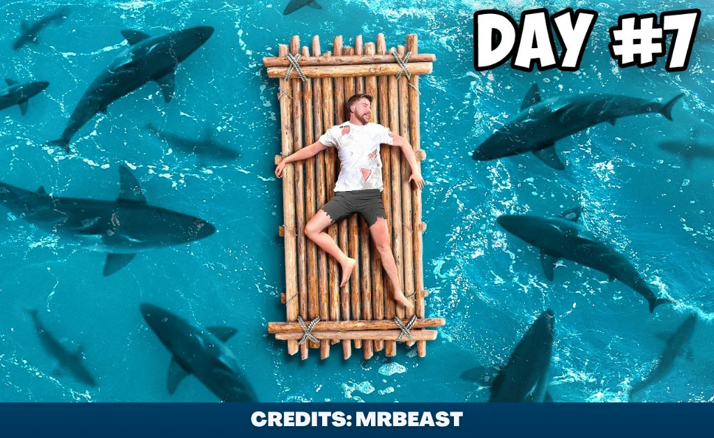
The main curiosity element is MrBeast himself stranded at sea. The other objects, like the raft, sharks, and text, all provide context about his situation.
Composition is how you arrange these contents within the frame. Consider using positioning to draw attention to your main curiosity element.
Principles like the rule of thirds, visual hierarchy, leading lines, depth, and scale can all subtly guide the viewer’s eye.
Finally, the contrast makes your thumbnail pop on the viewer’s screen. You want tons of contrast between your main element and the rest of the thumbnail.
There are 3 types of contrast you can leverage:
Luminosity contrast – Mixing bright colors with dark colors
Saturation contrast – Mixing saturated colors with muted colors
Hue contrast – Complementary colors that naturally stand out against each other
Mastering these 3 C’s takes time and practice. But keep them in mind with every thumbnail you create moving forward!
4. Killer Analysis
Whew…this thumbnail stuff is complicated, right?
By now, you might have the perfect clickbait thumbnail in front of you. But how can you be sure?
Well, top YouTubers run their thumbnails through 3 final “killer” tests:
The Clarity Test
This checks if your thumbnail makes sense when viewed at small sizes, like in the YouTube sidebar.
If you can’t make out every element even when shrunken down, get back to simplifying.
The Contrast Test
Here, you verify your thumbnail visually stands out when placed amongst other videos your audience watches.
If it blends into the noise, amp up what makes yours remark-able!
The Glance Test
Finally, flash your thumbnail to a friend for 2 seconds. See if they can grasp what it’s about based on a quick first impression.
If not, make things even more obvious and easy to digest.
Pass all 3 tests? Congrats, you’ve got a masterpiece!
Create Backup Thumbnail Variations!
I know it takes ages to make just one thumbnail.
So, it might sound crazy when I suggest making 3 total variations per video!
But hear me out…
Even when top creators nail the thumbnail, they still swap it out 20% of the time.
That’s because thumbnails contain some guesswork. You can never be 100% sure how viewers will respond.
So smart YouTubers hedge their bets by having backups ready in case the initial thumbnail flops.
These aren’t just color tweaks, either! They brainstorm 10-15 new concepts and flesh out the top 3.
That way, no matter what, they have strong clickbait options waiting in the wings to save an underperforming video.
Pretty next level, right? But this obsession with optimization is why their channels explode overnight!
Wrap it Up!
- Killer Time Allocation – Spend more time on your thumbnail than video
- Killer Psychology – Craft strong curiosity gaps that viewers need to satisfy
- Killer Design – Perfect the 3 C’s: Contents, Composition & Contrast
- Killer Analysis – Pass the clarity, contrast, and glance tests
Nail down this framework, have some stellar backups, and your channel will blow up quickly!
Now I want to hear from you…
What specific part of thumbnail creation do you struggle with most? Let me know in the comments!
All right, friends. Go out there and make some clickbait magic. I believe in you!

